by Marwan Salfiti | Oct 16, 2015
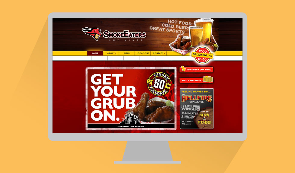
SmokeEaters was looking for a new site that would help communicate their slogan, “Hot Food. Cold Beer. Great Sports.” Geared towards a sports/college crowd, we built a website and social media themes to carry over their user’s experience to their online presence.
Branding, Web Design, Strategy

by Marwan Salfiti | Oct 16, 2015
Saint Ignatius College Prep
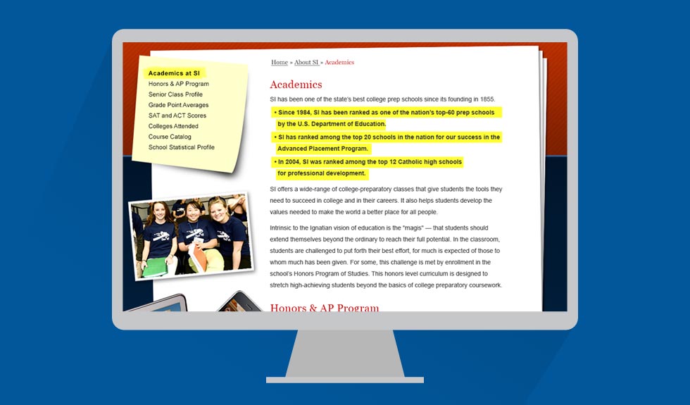
As an alumni of Saint Ignatius High School in San Francisco, I was first called upon to join in the board to reevaluate the school’s online presence. This was the main tool the school used in order to communicate with new applicants, current students, parents, teachers and alumni. The problem they faced was an monstrous archaic database archive. Naturally, from years of patching, they were left with a very confusing navigation structure and little resources to rebuild all of their content and link structure.
I was then hired to consult with them and bring some life to their online presence. After a series of interviews, student questionnaires and design iterations, I was able to help design and develop a new look and feel for the school which didn’t alter their current database structure, but rather “skinned” their content and played nice with their databases.
My design helped the school bring life to their online presence which was inline with the institutions mission, values and brand helping increase the site’s overall performance and User Experience.
Saint Ignatius College Preg
Creative Direction, Web Design, User Interface, User Experience

by Marwan Salfiti | Oct 16, 2015
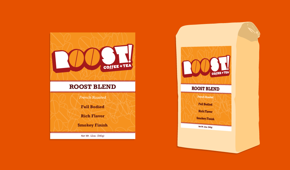
When the client approached me with his new venture, he really believed in the authenticity and quality of his product. He believed he had created the best tasting coffee blend to make a truly special cup of coffee. The client’s strong conviction was very helpful in the process of creating a strong brand and identity for his new venture. He wanted Roost to become a strong brand in line with other larger name companies. This led me to go in a direction with strong, original typography and bold colors. Our goal was to define his brand with an identity as strong and bold as his product.
Branding, Creative Direction, Identity, Packaging

by Marwan Salfiti | Oct 16, 2015
Hardtke Construction, a small local operation, needed a logo and identity which would help them look more professional in order to get more contracts. After listening to them, I realized they were all about the craft and quality of their work. I wanted to really incorporate the most basic tools they used in order to get the job done. The clever use of the lumber stack to spell out the H in Hardtke was a unique visual the client was ecstatic about. This was a fun and rewarding project which was effective in its application.
Branding, Creative Direction, Identity

by Marwan Salfiti | Oct 16, 2015
Green Chiropractic Clinic
The Green Chiropractic Clinic is taking a new approach to alternative healing, going green. They want to move to a paperless office and minimize the impact of business on the environment while still healing their patients. The project goal was to marry a very established medical field with this more modern concept.
I helped to do this by identify the most simple element of chiropractic care with color palette and typography. The end result was a simple, visually refreshing mark which spoke the patients as well as the doctor’s practice.
Green Chiropractic Clinic
Branding, Creative Direction, Identity